
Carbonation Press Logo
Client: Greg Bem, Carbonation Press, Spokane, WA
Scope: Logo design (full identity system)
Role: Brand identity and logo designer
Platform: Print and digital applications
Timeline: February – April 2026
Context: Carbonation Press is an independent literary imprint founded by Greg Bem, rooted in experimentation, community, and the production of literary works outside traditional publishing structures. Operating as a volunteer-driven project, the press supports a wide range of voices and forms, with an emphasis on openness, accessibility, and creative exchange.
Rather than positioning itself as a fixed institution, Carbonation Press functions as an evolving system—fluid, exploratory, and shaped by the contributions of its authors and collaborators. The identity needed to reflect this sense of ongoing formation: something defined, yet adaptable; structured, but not static.
From the outset, the goal was to create a mark that could hold this balance—suggesting internal movement while remaining clear, legible, and usable across small-format applications such as book spines and social media.
The Challenge: The challenge was to translate an abstract set of forces into a single, legible form:
Energy held in suspension
Movement, circulation, and accumulation
Generative interaction—forces shaping one another over time
A visual language appropriate for a literary press—expressive, but controlled
Early explorations moved in multiple directions, including circular systems, release mechanisms, and more literal interpretations of “carbonation.” The task became one of distillation—identifying a form that could suggest internal activity without becoming illustrative, while still reflecting the press’s fluid, community-driven nature.
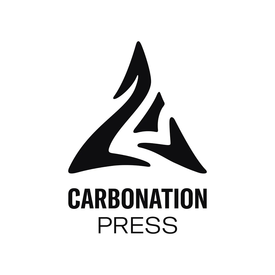
The Solution: The Carbonation Press logo explores energy organizing into form through directional movement. A triangular vortex suggests circulation and accumulation—energy held in suspension as forces gather and begin to take shape.
Through iterative refinement, the mark evolved into a directional form in which:
Internal lines suggest circulation and accumulation
The triangular structure provides containment and stability
The form feels generative—emerging in real time rather than fixed
Key design decisions included
Directional Energy
Using softened angular geometry to suggest upward movement and internal momentum.
Generative Form
Designing the mark to feel active—an event in progress rather than a static symbol.
Restraint and Legibility
Maintaining clarity at small sizes, ensuring the mark functions across book spines, covers, and digital applications.
The Result: The final logo provides Carbonation Press with a distinctive identity that reflects its conceptual foundation. The mark is structured but dynamic, conveying a sense of energy organizing into form while remaining open and in motion.
It functions as a flexible system across print and digital contexts, while maintaining a clear and recognizable presence.
What This Project Demonstrates:
Translating abstract forces into visual structure
Designing for tension between movement and control
Creating marks that feel active rather than static
Building identity systems grounded in concept rather than trend
Response to the Work
Working with Roberta Hoffman on the Carbonation Press logo was a wonderful experience. Each step of the process led to new discoveries and incredibly artful discussions reflecting on the deeper aspects of the Press's functions and identity. I truly appreciated Roberta's listening, thorough explanation, and conversation-centered approach to finding a logo that worked perfectly for Carbonation.
— Greg Bem, Carbonation Press (April 2026)

Carbonation Press Logo multicolor

Carbonation Press Logo circular type
Carbonation Press Logo stacked
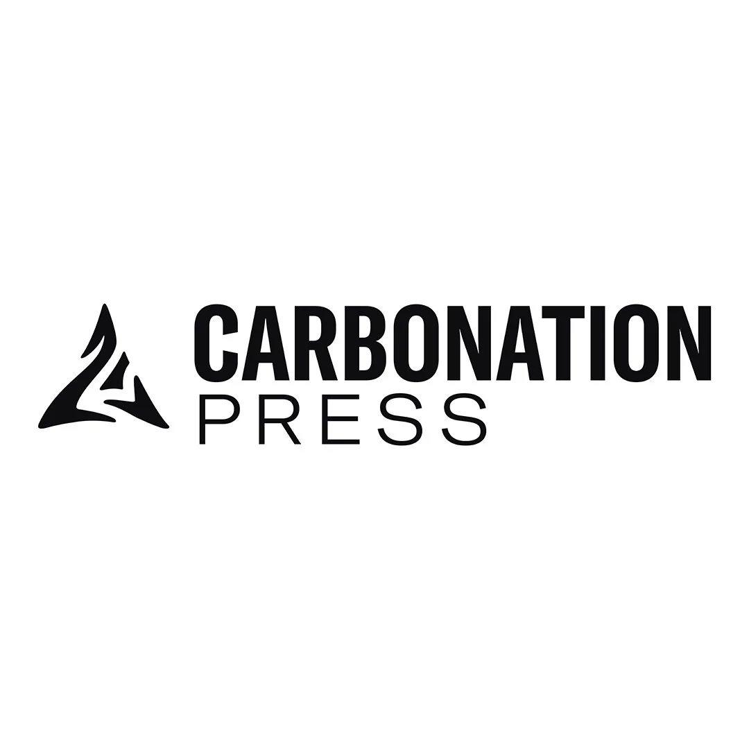
Carbonation Press Logo horizontal